
Intro
Hypermeter is a FinOps platform that gives enterprises visibility into cloud spend and utilization. It ingests cloud consumption data, makes sense of it, and lets users explore what they find.
The platform grew out of Exivity On-Prem, a product with two main uses: pay-as-you-go pricing for managed services providers, and FinOps reporting for large organizations. Exivity wanted to reach a broader audience by building something more focused, with less friction.
Hypermeter was built from scratch, in a domain that was still being defined. As the sole designer, I owned the entire user experience and visual design. I worked closely with engineering throughout, getting deep enough into the architecture to propose technical approaches that let features work the way I'd envisioned.
I come from a software engineering background, so I design with a sense of what's actually buildable, which moments in a user journey are worth focusing on, and how to describe them to engineers in terms they recognize. For a few components, the Response Previewers and Dynamic Template Inputs, I built the frontend myself to get the behavior exactly right.
Low-Code Workflows
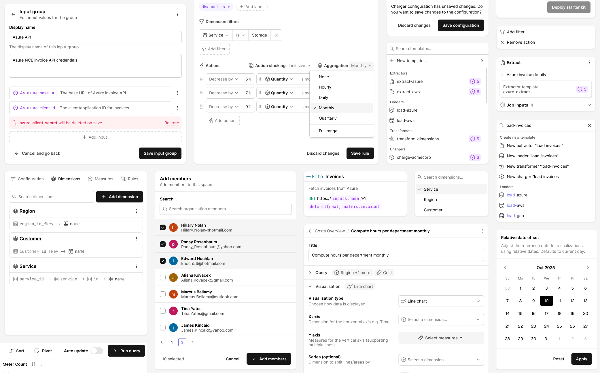
Data ingestion is central to Hypermeter. Pulling data from REST APIs, databases, and storage buckets is genuinely complicated, and I wanted it to feel manageable even for someone who hadn't done it before.
The Canvas
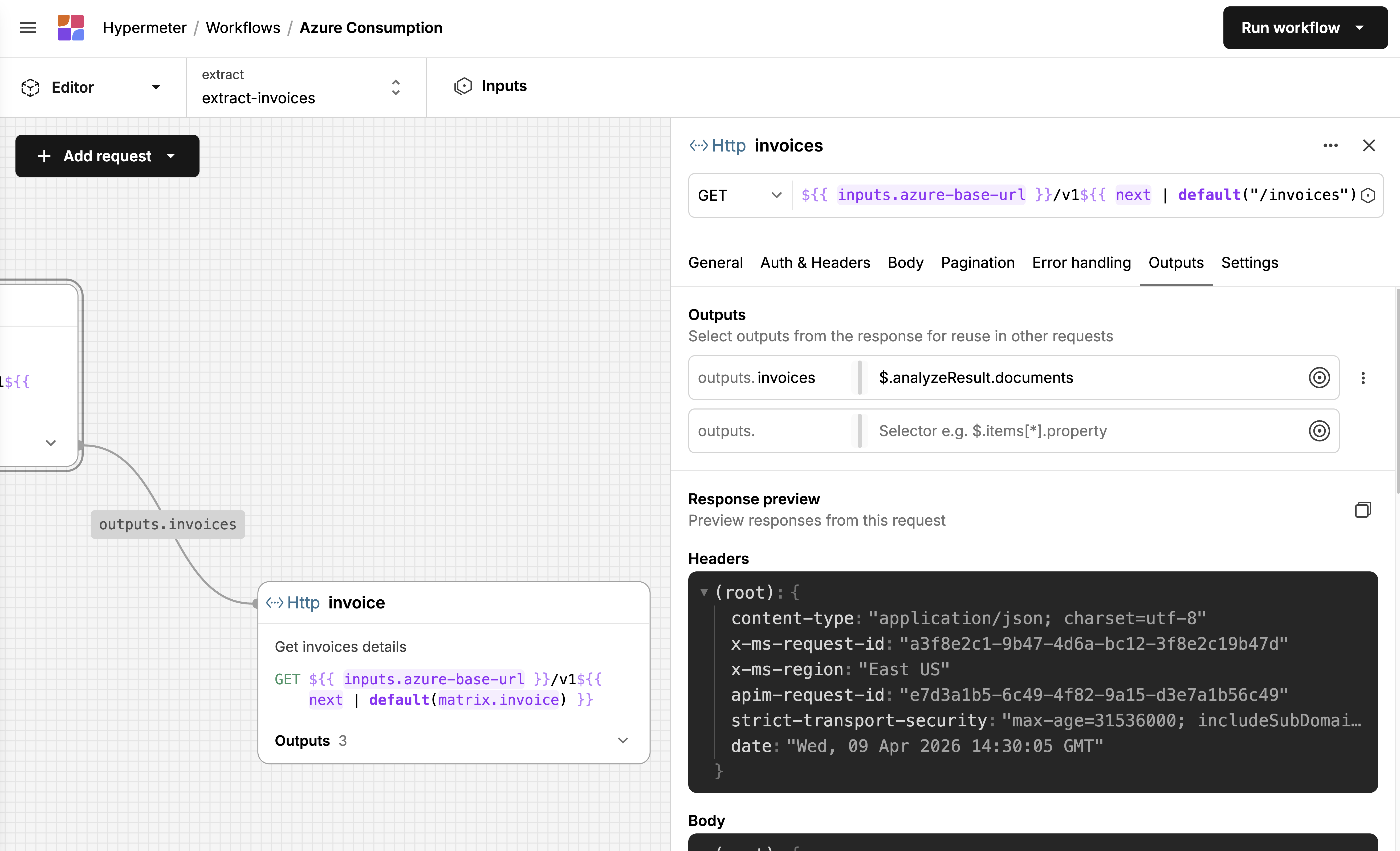
The extractor is usually the first job in a workflow and almost always the most complex. It's where users define how to fetch raw data from external sources, REST APIs most often, but also databases and storage buckets. A single extractor might need to authenticate, fetch a list of resources, paginate through results, and then loop over each item to fetch its details. Each request depends on the previous one: one response feeds into the next request's URL or body. That chain is the core complexity. In Exivity On-Prem, extraction was scripted in a custom DSL, which meant users needed to learn a proprietary language before they could pull data from an API. I wanted Hypermeter to feel familiar to anyone who'd used Postman or a similar API client, while still handling the chaining and iteration that real data fetching requires.
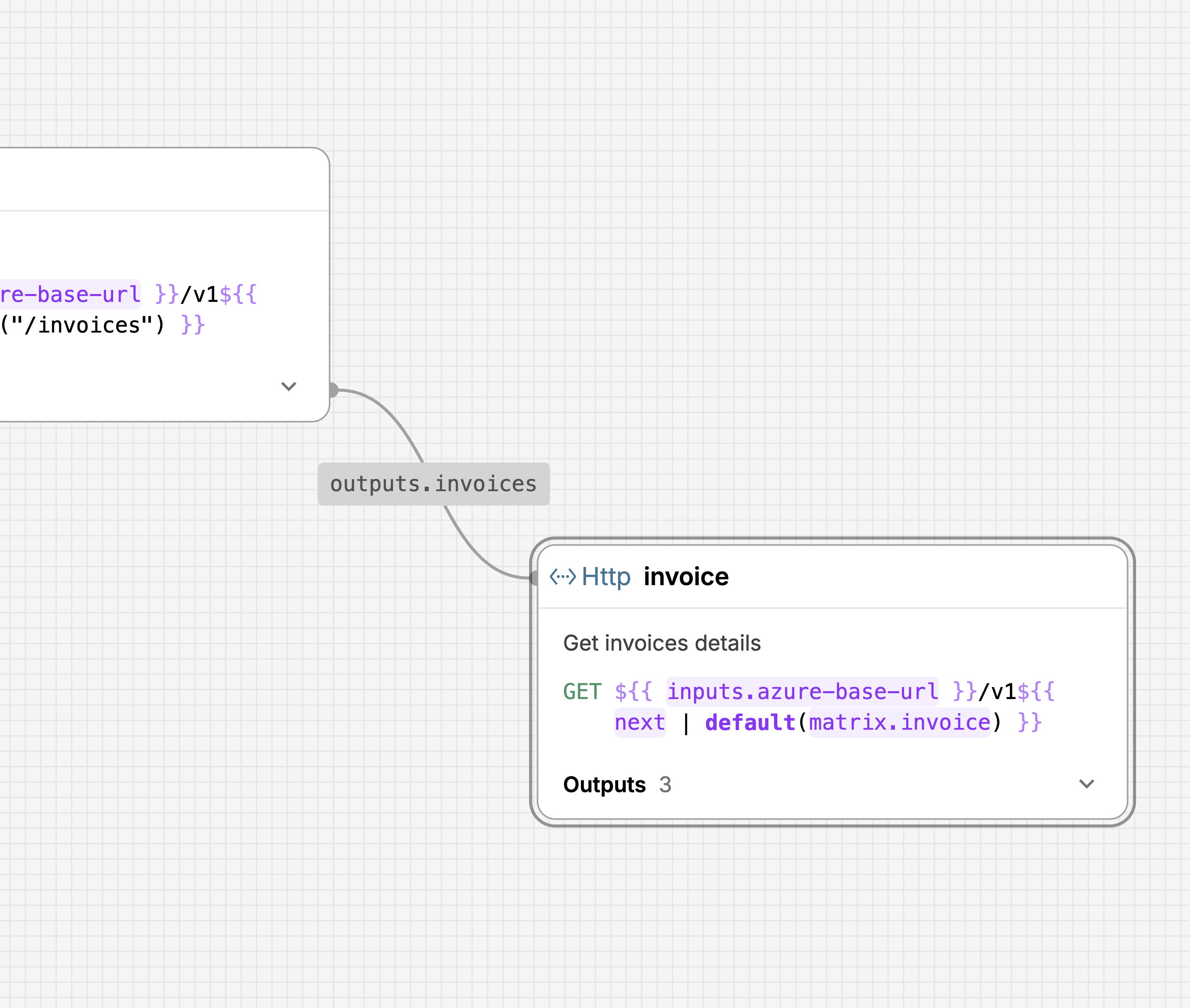
I landed on a visual canvas where each request is a node on a graph, connected by edges that show data flowing between them. You can see at a glance that the "invoices" request feeds a list of IDs into the "invoice" request, which loops over them via a matrix. A form-based wizard or a flat YAML file wouldn't show you that. Even with a handful of requests, it gets hard to track dependencies when everything is listed linearly. Putting them on a canvas makes the relationships spatial.
Each node shows the essentials: method, URL, name, description, and how many outputs it defines. Clicking a node opens a sidebar where the actual configuration happens: auth, headers, body, pagination, error handling, outputs. It's a structured form, so the barrier is low. You don't write YAML. You fill in fields. The canvas shows you how those fields connect across requests.
Response Previewers
Exivity On-Prem gave you limited feedback when building workflows. You'd write an extraction script, run it, and find out after the fact whether it had worked. I wanted Hypermeter to tell you whether you're on the right track before you commit to a full pipeline run.
JSON Response Previewer 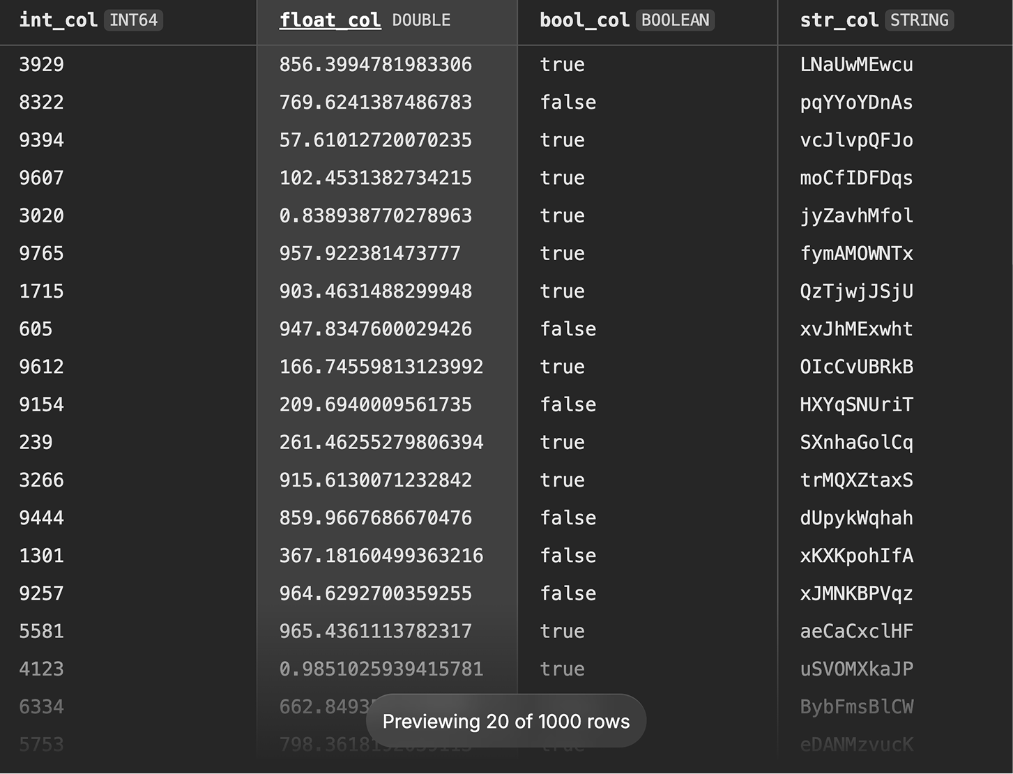
Parquet Response Previewer 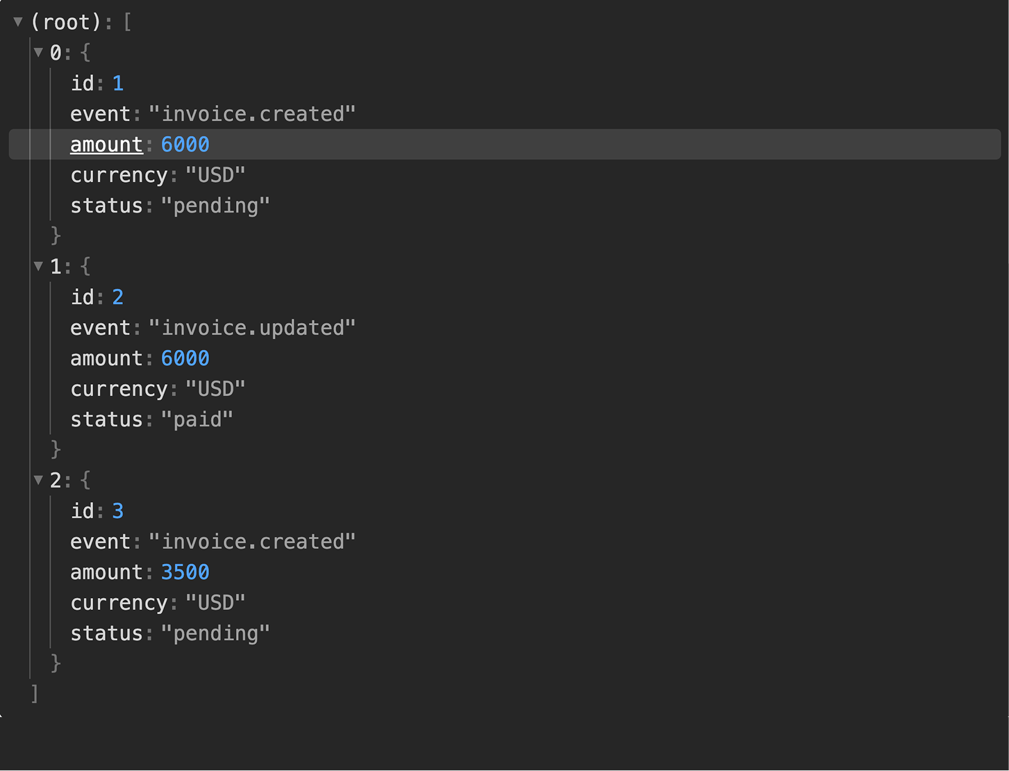
JSONLines Response Previewer 
CSV Response Previewer 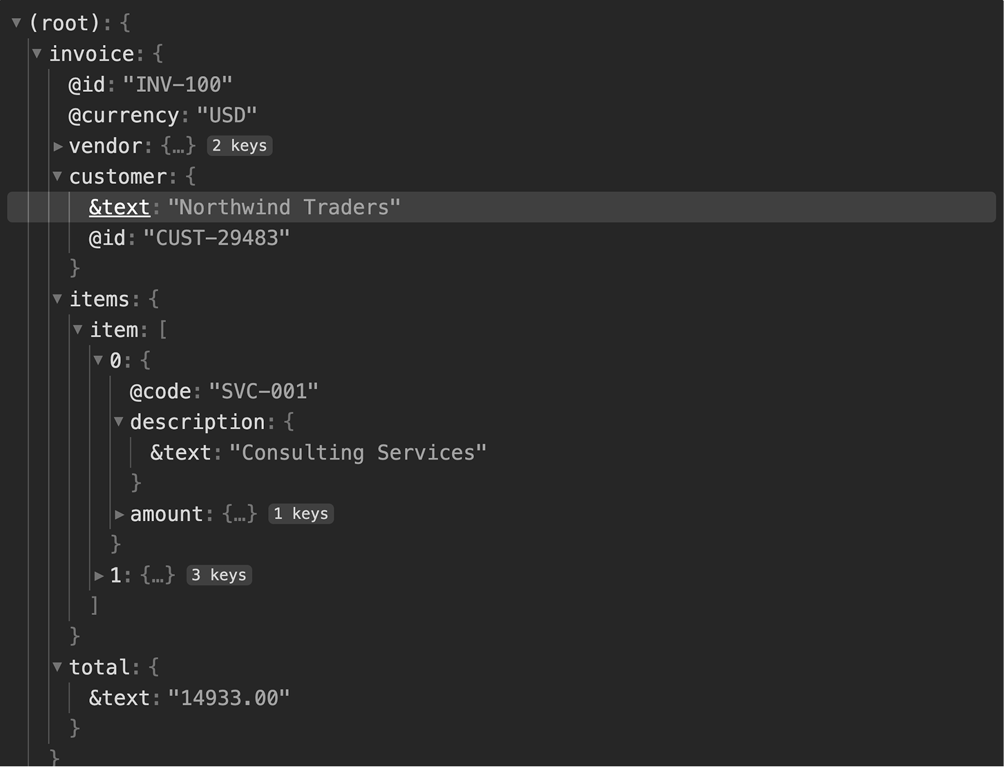
XML Response Previewer
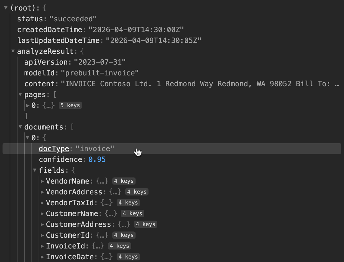
After a request runs, the Outputs tab shows the actual response, headers
and body, as an interactive tree. JSON expands and collapses, arrays show
their members, and the structure looks like what you'd see in browser dev
tools. You can click any value in the tree to generate a JSONPath selector
for it, which becomes an output definition. Instead of hand-writing
$.analyzeResult.documents[*].fields.VendorName, you just click the
value. I built previewers for JSON, XML, CSV, JSON Lines, and Parquet.
All follow the same pattern: make the structure browsable, make values
selectable.
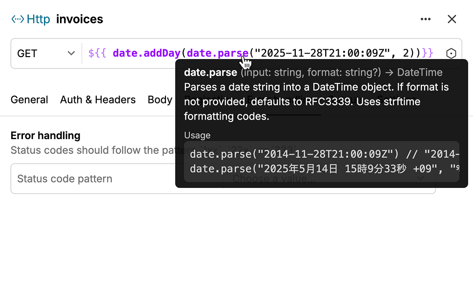
Dynamic Template Inputs
I also implemented the template editor used across URL fields, header values, and authentication forms. The extractor uses template strings like to reference inputs, outputs from previous requests, pagination cursors, and functions.
// basic example
${{ inputs.azure-client-id }}

// usage with auth
https://login.example.com/${{ inputs.azure-tenant-id }}/oauth2/v2.0/token

// simple function
https://api.example/v1${{ next | default("/invoices?size=1&offset=0") }}

// complex function with filtering
${{ filter(
  fn(invoice) {
    return date.isBetween(
      date.parse(invoice.billingPeriodStartDate),
      date.toStartOfMonth(inputs.start-date),
      date.toStartOfNextMonth(inputs.start-date)
    )
  },
  outputs.invoices
) }}

// deep matrixing
${{ matrix.root }}/${{ matrix.blob.name }}?${{ matrix.sas-token }}
I went through a lot of iterations on how to present these. Early attempts tried to hide the template syntax behind a more visual interface, but internal testing showed that backfired. Hiding the syntax made it harder to tell what was a literal string and what was dynamic. The final design keeps the raw syntax visible, with highlighting so the dynamic parts read differently from static text. An autocomplete dropdown shows what variables are available, inputs, outputs, matrix values, so you don't need to memorize anything.
Configurable View Dashboards
Once data moves through the pipeline and lands on a cube in the semantic layer, it needs to reach the people making spending decisions. Views are Hypermeter's dashboarding surface, built entirely on cubes so the reporting layer is fully separate from the pipeline underneath.
A view is a dashboard made up of visualizations: KPI cards, bar charts, time series, tables, pie charts. Every view inherits the full set of dimensions and measures from its base cube. Each dashboard can also define local fields, custom calculations that exist only within that view. A shared data model might expose a raw cost measure; a dashboard author can extend it with a year-to-date rolling total without touching anything upstream. Teams get the flexibility to answer their specific questions without polluting the shared model.
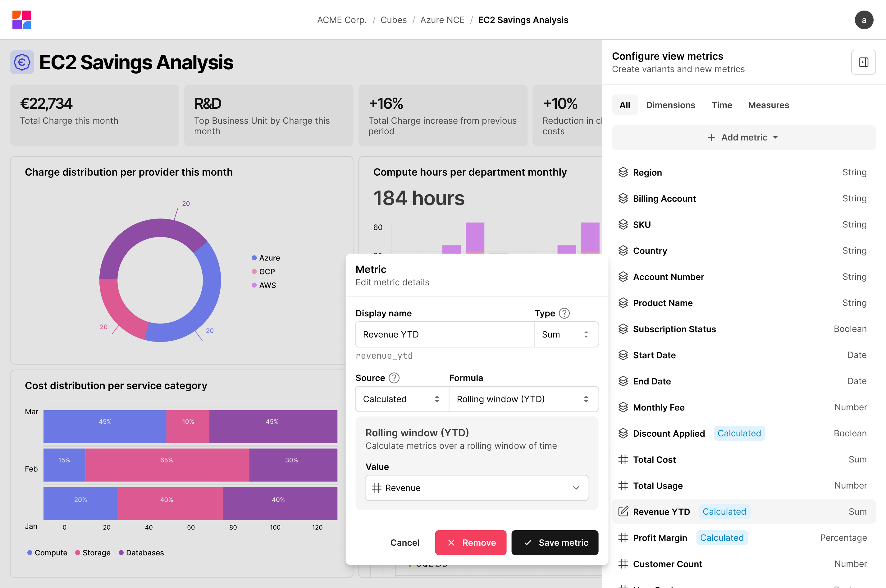
Metric Authoring
The metric panel lets you create and edit custom metrics without leaving the dashboard. You name it, choose how it should aggregate (sum, average, running total) and point it at the data. Year-to-date windows and period comparisons are there if you need them, but not required. I built it as a sidebar so changes take effect while you're looking at the thing you're changing, not after navigating back to it.
Visualization Composition
Each visualization defines its own query: which measures to aggregate, which dimensions to group by, what time granularity, what filters. Two visualizations on the same dashboard can query completely different slices of the cube without touching each other. A KPI card for total spend this month and a bar chart breaking down cost by provider pull from the same data, just shaped differently.
I also built support for compare date ranges, so visualizations can show period-over-period changes as a first-class feature instead of requiring separate queries you manually compare. Combined with segments, reusable filter predicates like "production workloads only", the dashboard covers most real questions without needing to drop into an ad hoc query tool.
Visual Design Language
Hypermeter needed its own visual identity, precise and technical, but not cold. The platform deals in data pipelines, semantic models, and cost analytics, so there's a lot of conceptual density to make readable.
Custom Icon Set
I designed a custom icon set of over 50 glyphs for Hypermeter's domain. Off-the-shelf libraries didn't have what I needed. There's no generic icon for a cube, an extractor, a charger, or a result set. Each concept needed a distinct symbol that users could learn once and recognize instantly in navigation, toolbars, and canvas nodes.
The icons use a consistent stroke weight and a geometric, angular feel. I carried the logomark's motif, rounded interior curves meeting a sharp grid, into several of them to tie the set back to the brand. The goal was a set cohesive enough to read as a family, but where each icon was distinct enough that you could tell a workflow from a transformer at sidebar scale.